- Creat a working directory lab5 and download the source files from Lab Tutorial folder. Import all files into Eclipse.
- install pandas and pyreadstat and test run "dacP1.py"
- Shift+Right-Click to start Windows PowerShell in the directory created
- type "pip install pandas"
- type "pip install pyreadstat"
- type "python dacP1.py"
- open "markData.*" with "Notepad" and explain the difference you see.
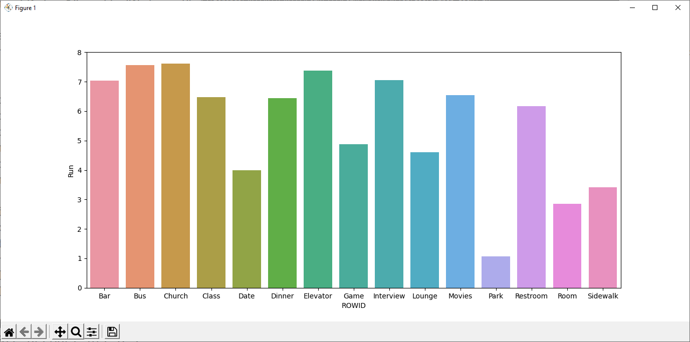
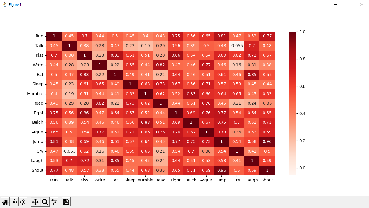
- install matplotlib and seaborn print bar chart and correlation heatmap using "behavior.sav" from
a social behavior study - 52 students were asked to rate the combinations of 15 situations and 15 behaviors on a 10-point scale ranging from 0="extremely appropriate" to 9="extremely inappropriate." Averaged over individuals, the values are taken as dissimilarities.
- type "pip install matplotlib" in command prompt
- type "pip install seaborn" in command prompt
- type "python dacP2.py"
- type "python dacP3.py"
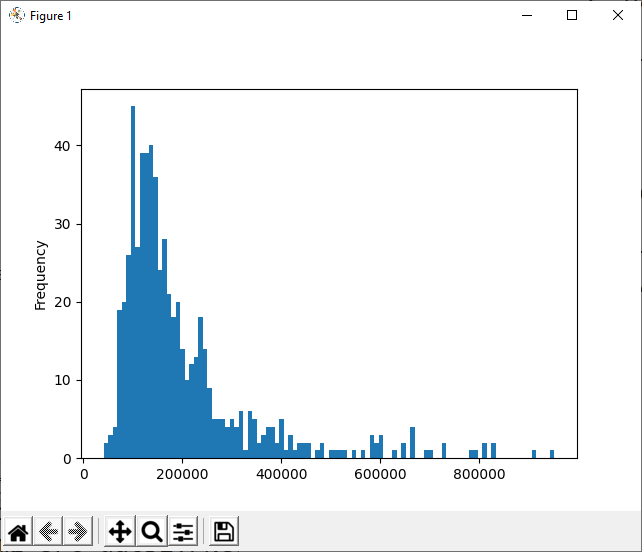
- more data analysis and charting examples using "sme-banking-data.csv"
- type "python dacP4.py"
- frequency distribution of non-numerical values
print(df['Major_ClientBase'].value_counts()) China 103 Hong Kong 103 Malaysia 102 Philipines 102 Singapore 102 Taiwan 102 Name: Major_ClientBase, dtype: int64 - pivot table
print(df.groupby('Business_Class')[['Income_YTD']].median()) Income_YTD Business_Class Apparel 135960 Electronics 164000 Health Care 179660 IT 142000 SME 147640 Smart Living 113320 Trading 165980 - Distribution analysis
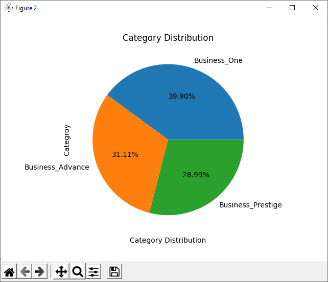
- Pie chart
- In Eclipse, copy and paste the following program to create a new module:
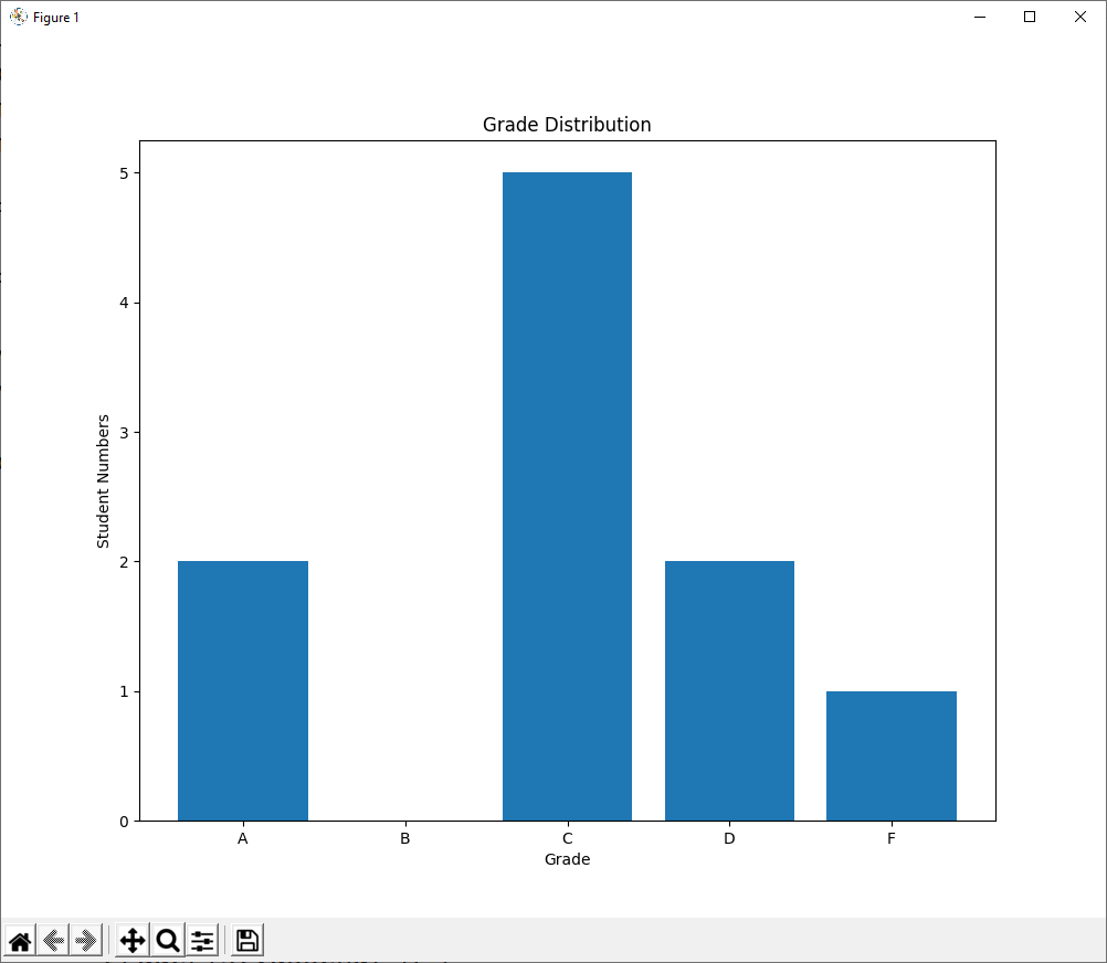
import pandas as pd import matplotlib.pyplot as plt df = pd.read_spss('markData.sav') df['Final'] = df['CW'] * 0.5 + df['Exam'] * 0.5 gradeList = [] gradeFeq = {'A':0,'B':0,'C':0,'D':0,'F':0} for row in df.index: if df['Final'][row] < 40: pass fig = plt.figure(figsize=(10,8)) # width x height in inches ax1 = fig.add_subplot(111) ax1.bar(['A','B','C','D','F'], [gradeFeq['A'],gradeFeq['B'],gradeFeq['C'],gradeFeq['D'],gradeFeq['F']]) ax1.set_xlabel('Grade') ax1.set_ylabel('Student Numbers') ax1.set_title('Grade Distribution') plt.show() - complete the programe to output the bar chart of grade distribution